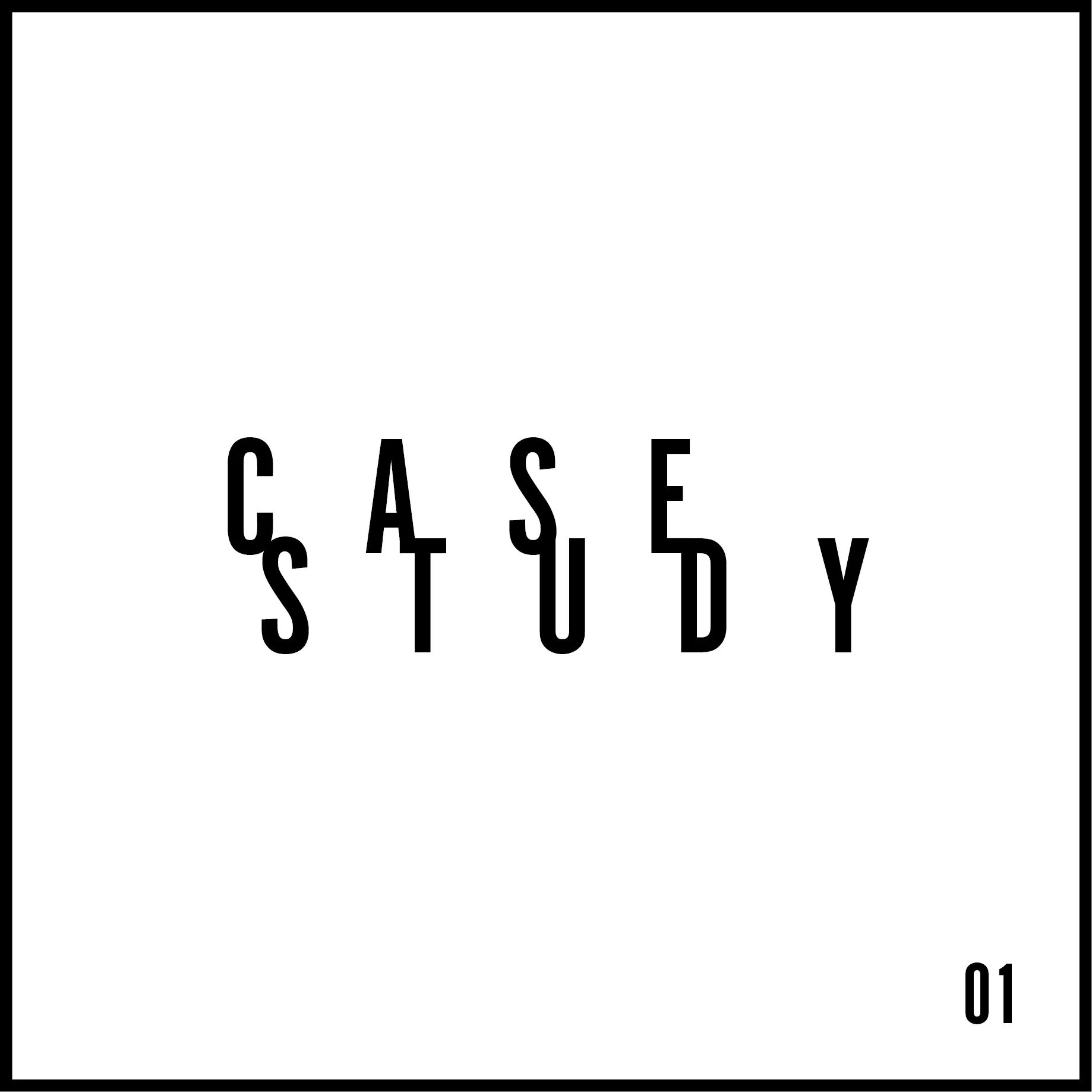
Case Study 01: Album
Cover & Lyric Book Redesign
Jan — Feb 2024
Software Used: InDesign, Illustrator, Photoshop
Skills Gained: Typography pairing, baseline grid, layout, constraint
Case Study 01 is an album by Canadian R&B artist
Daniel Caesar. It tackles stories of relationships, breakups, and his growth as a musician. This fundamentals project reimagines the album cover, alongside a lyric book.
The focus of this redesign is to only use typography, layout, and colour to express the emotions/feel of the album.
Research
I first did some primary research on the artist and the contents of the album.
On Daniel Caesar
Canadian R&B singer/songwriter
Born in Oshawa, ON
Grew up with soul and gospel music
His 2017 debut album “Freudian” won a Grammy
Inspirations: Frank Ocean, Kanye West and Beyoncé and The Doors frontman Jim Morrison
Currently in the top 10 “Most Streamed Canadian Artists of All Time” on Spotify
loves making music on romance
On Case Study 01
Released June 28, 2019
Title is stylized in all caps
10 tracks (also in all caps)
He wanted to dig into himself — case study on himself
Science was a backbone (physics—thermodynamics)
The sound is more experimental, especially from his previous album “Freudian”
Still very R&B and soul
Has a little dark undertone
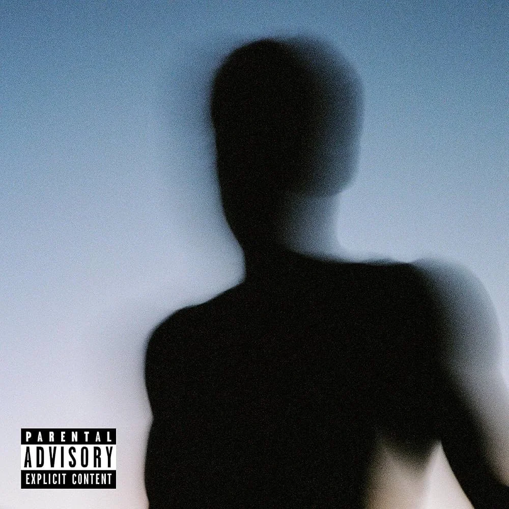
original album cover
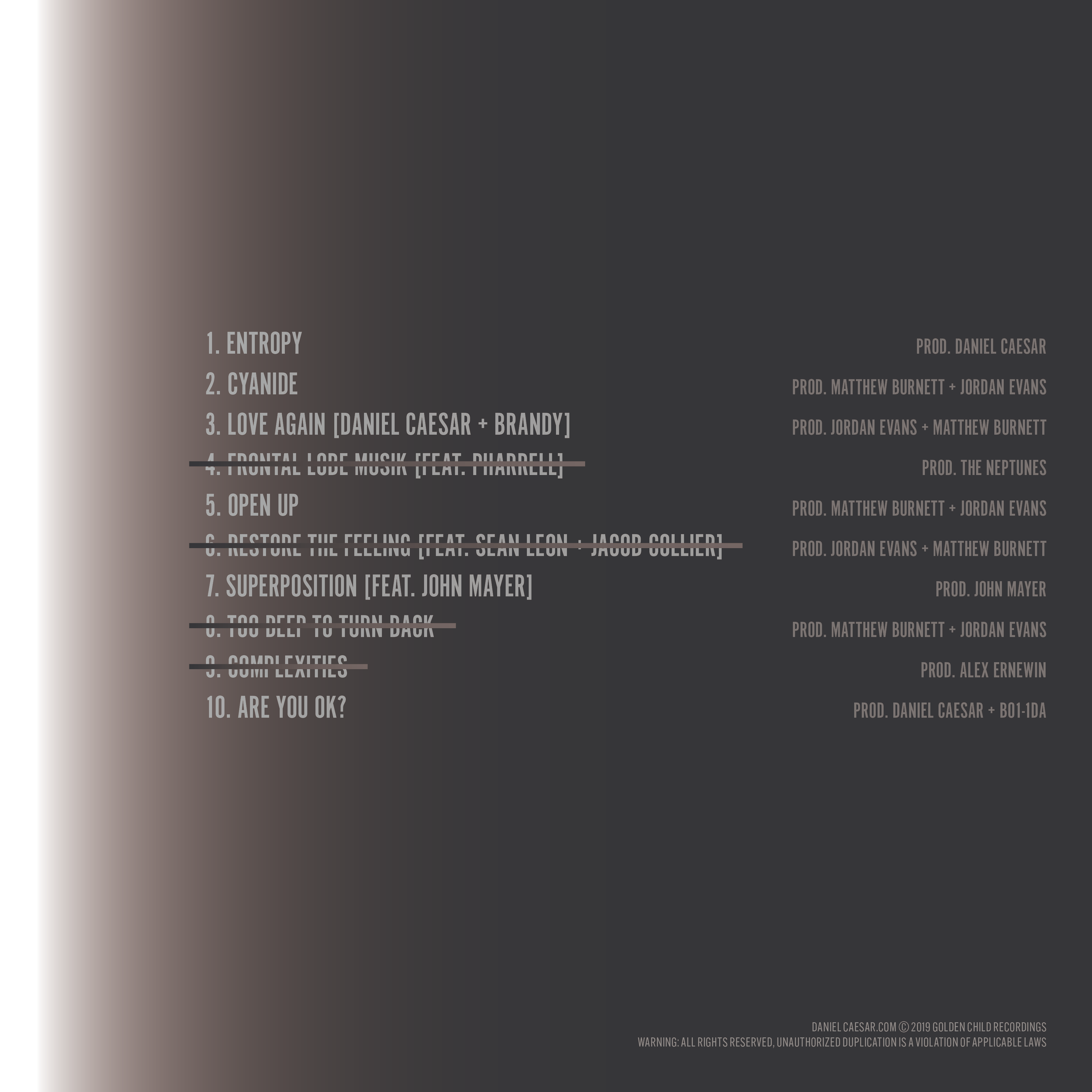
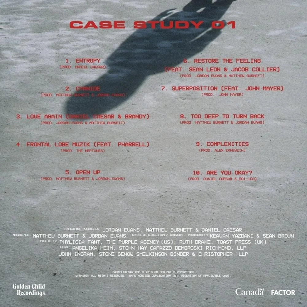
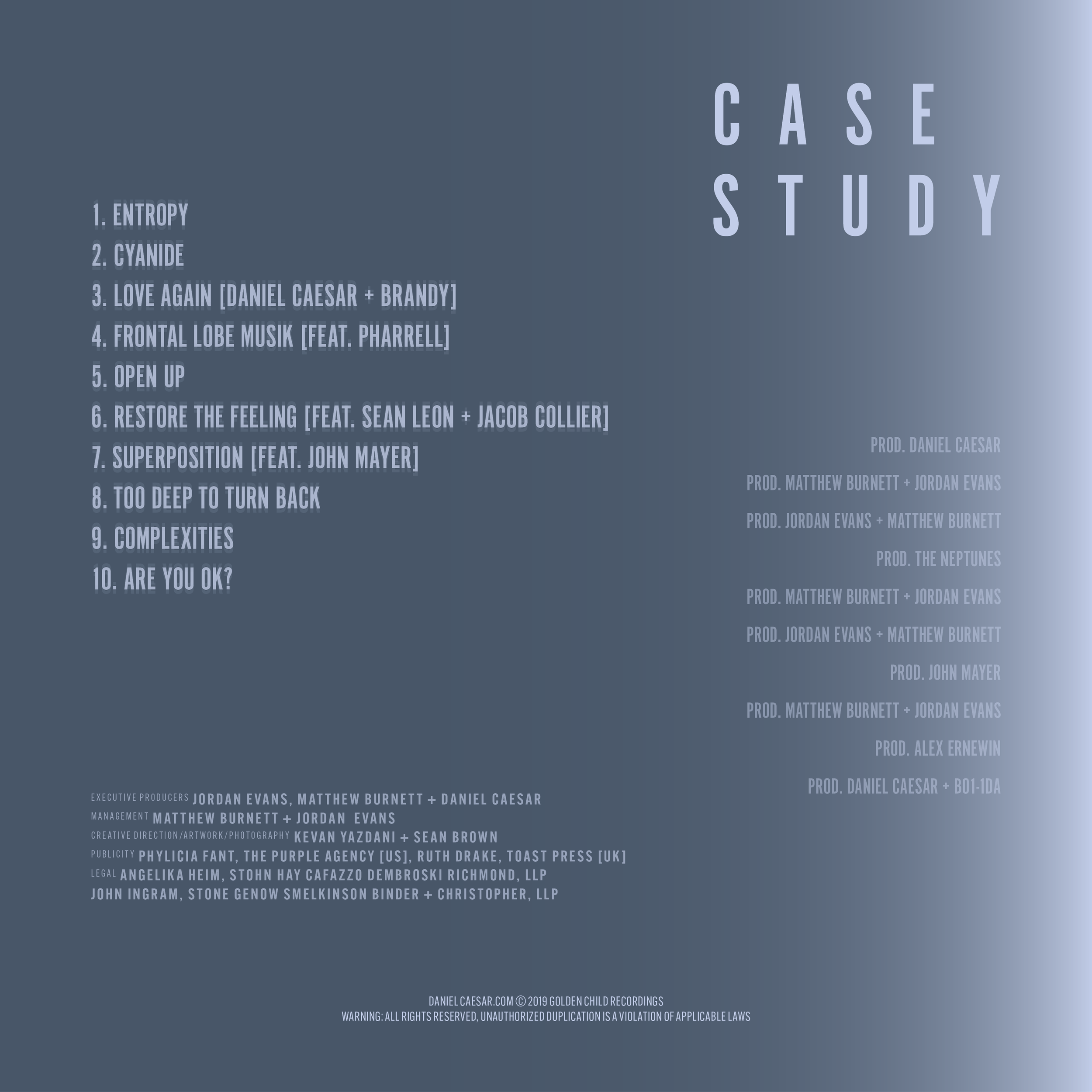
Tracklist
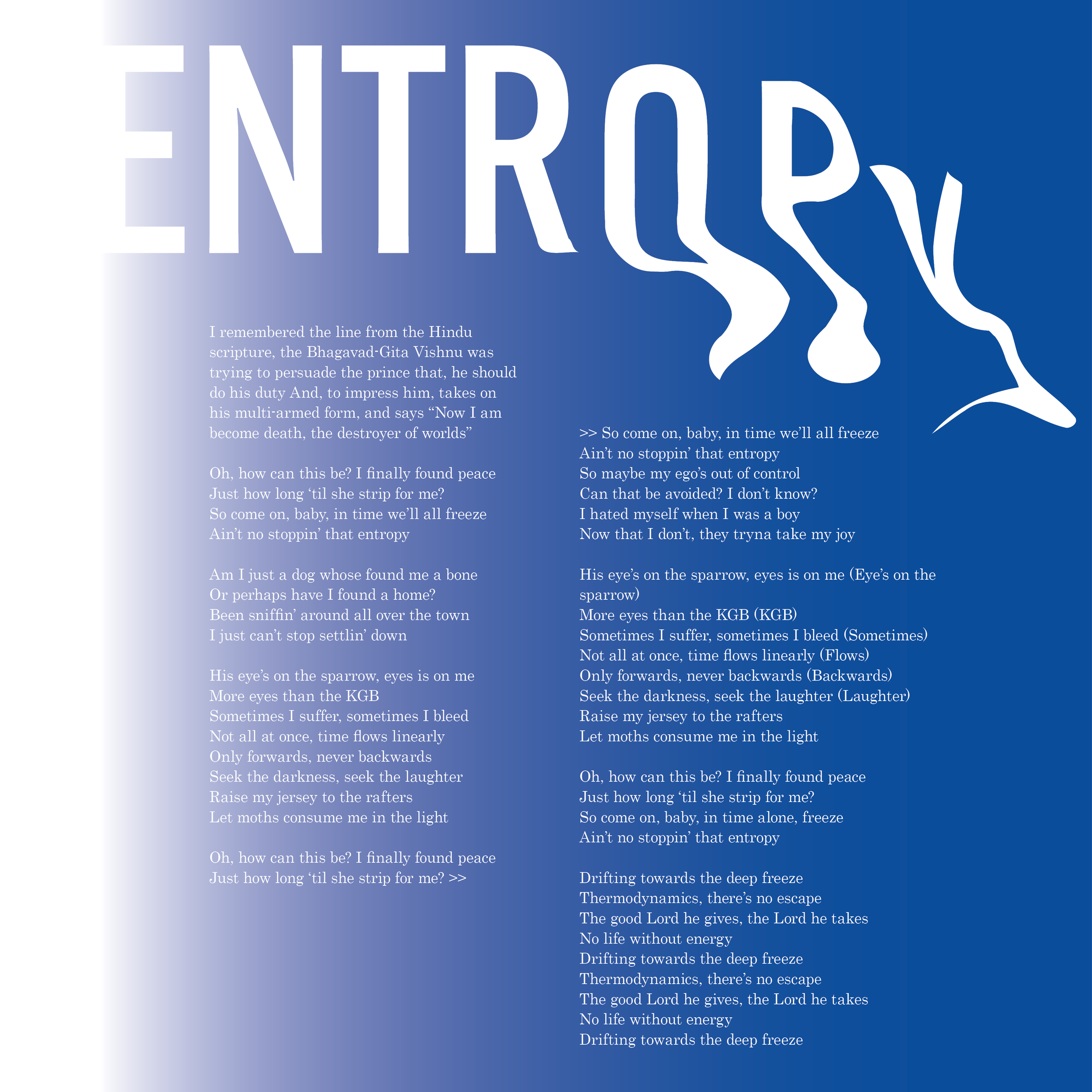
ENTROPY
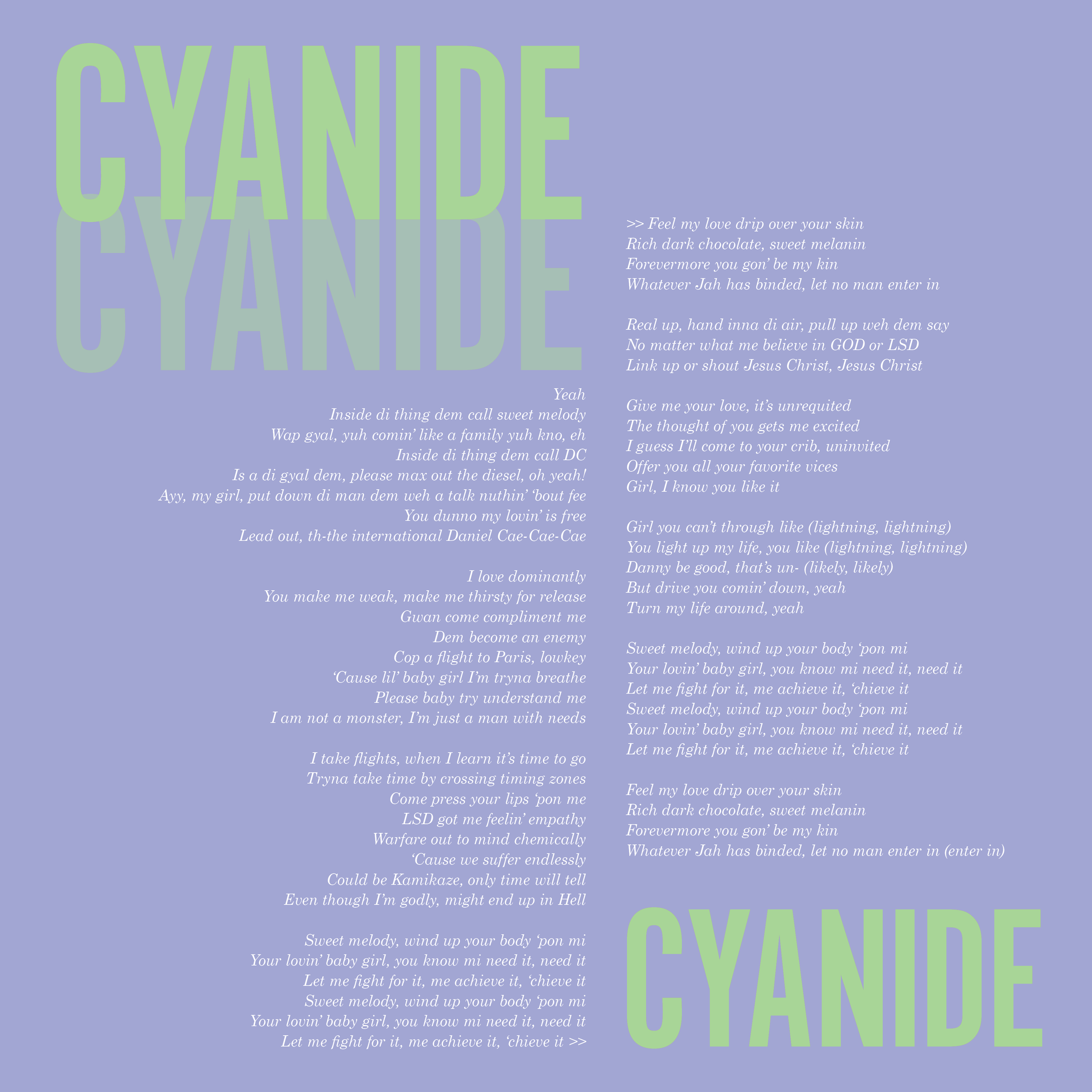
CYANIDE
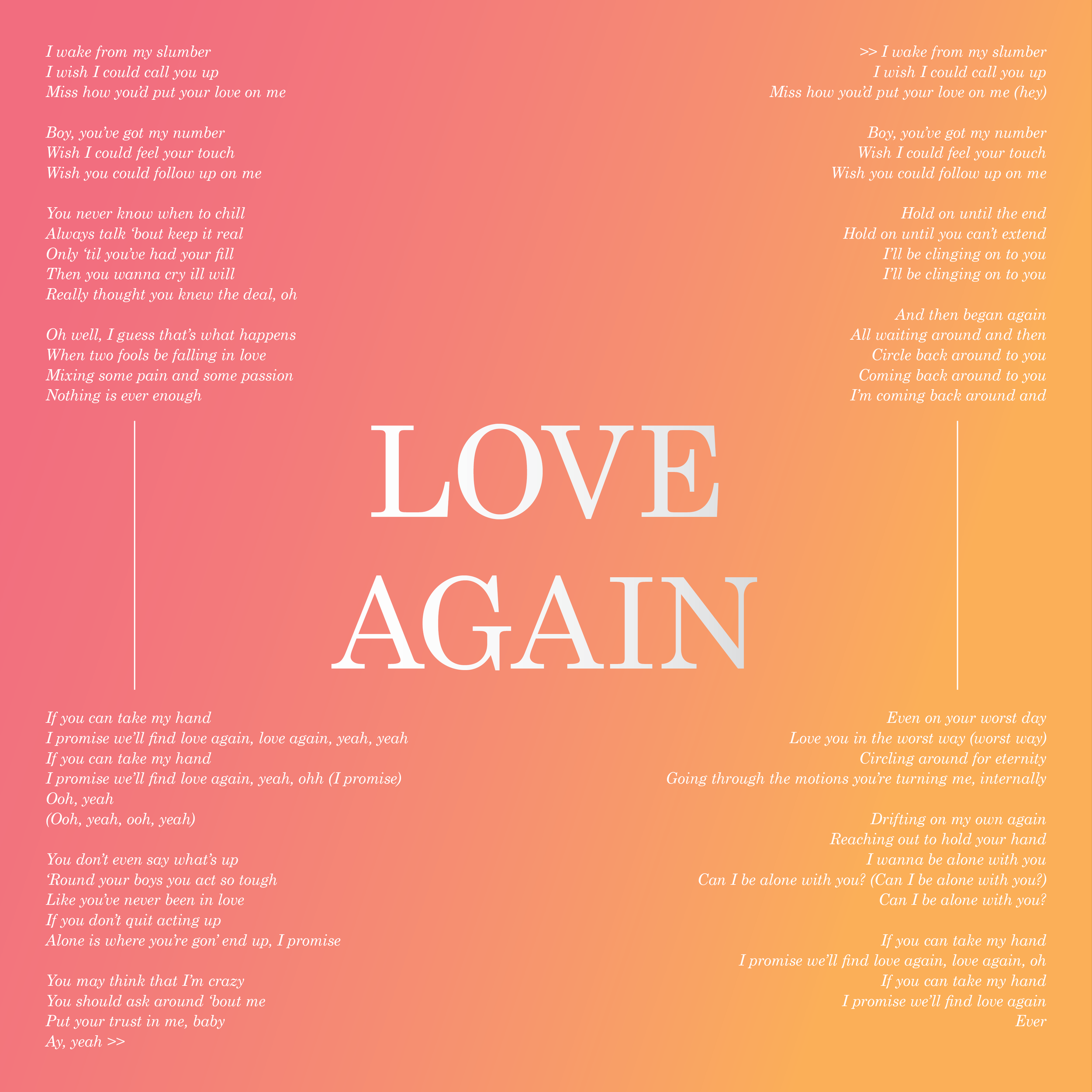
LOVE AGAIN
FRONTAL LOBE MUSIK
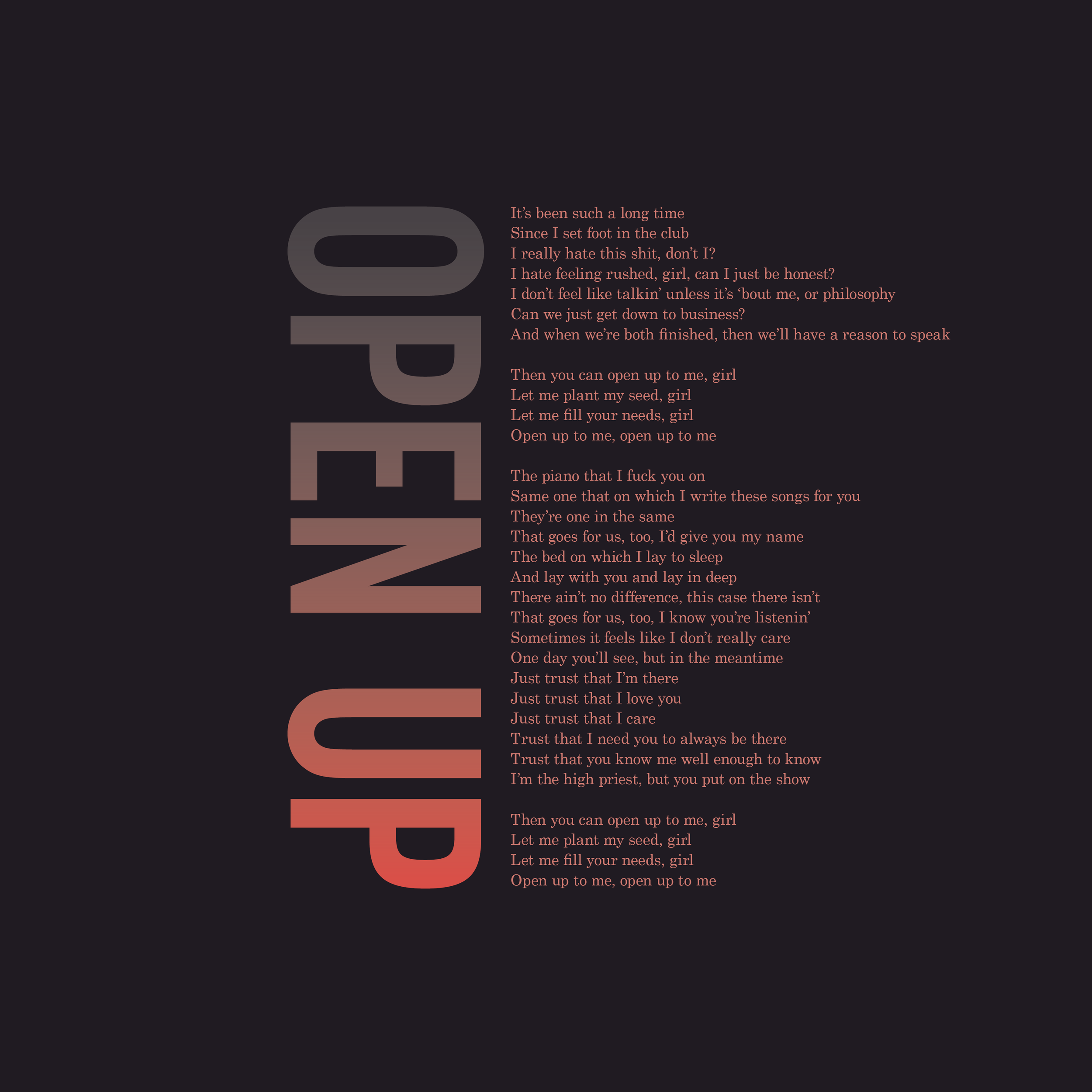
OPEN UP
RESTORE THE FEELING
SUPERPOSITION
TOO DEEP TO TURN BACK
COMPLEXITIES
ARE YOU OK?
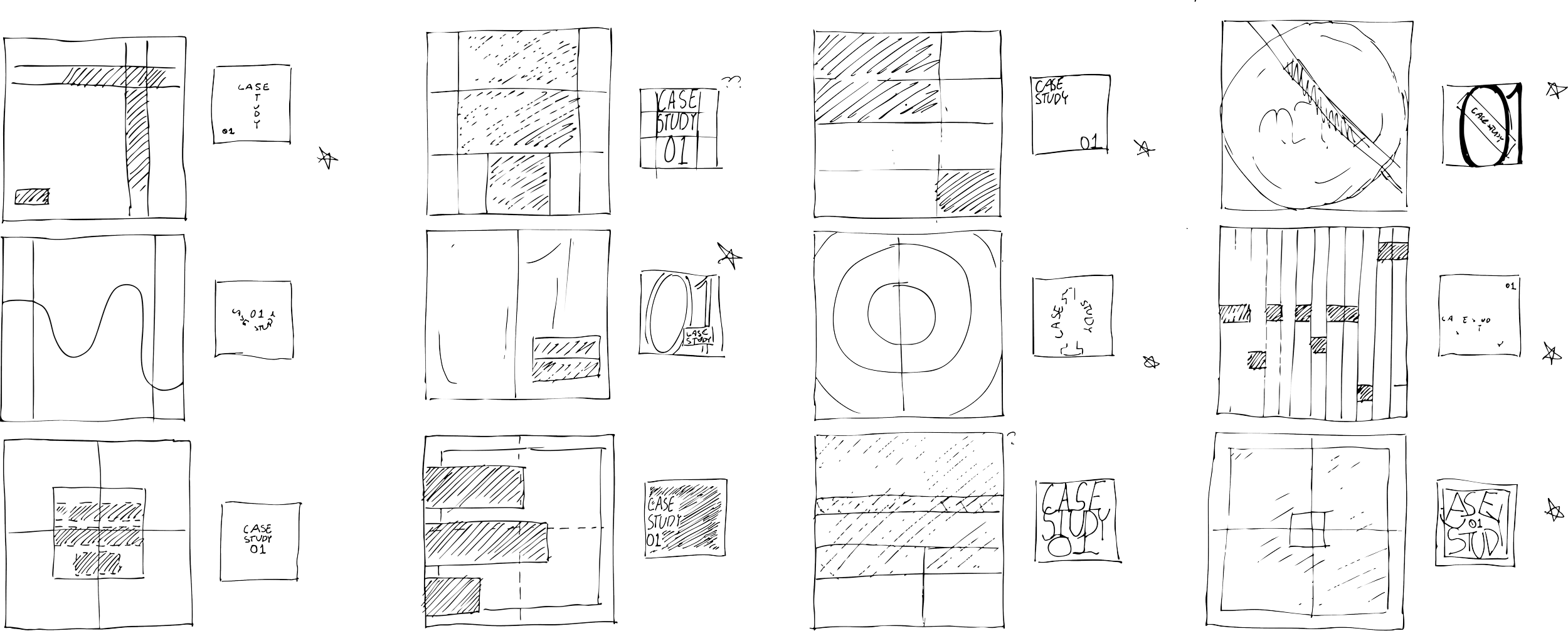
Layout
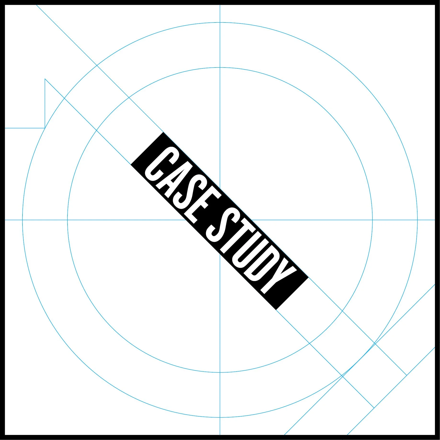
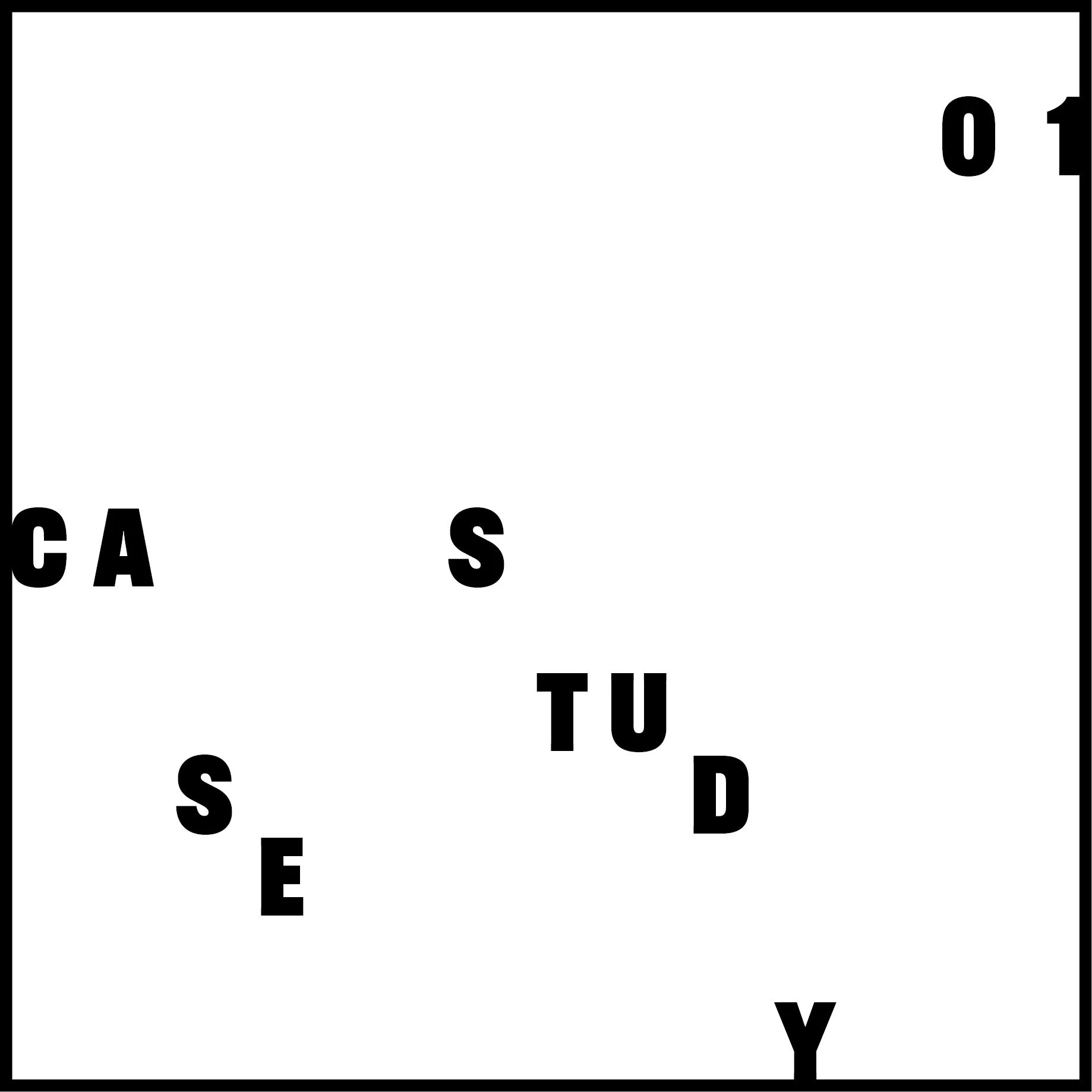
Using grids and guides on InDesign, I made a couple of possible layouts for the cover.
I wanted to create a variety of layouts while staying true to my research.
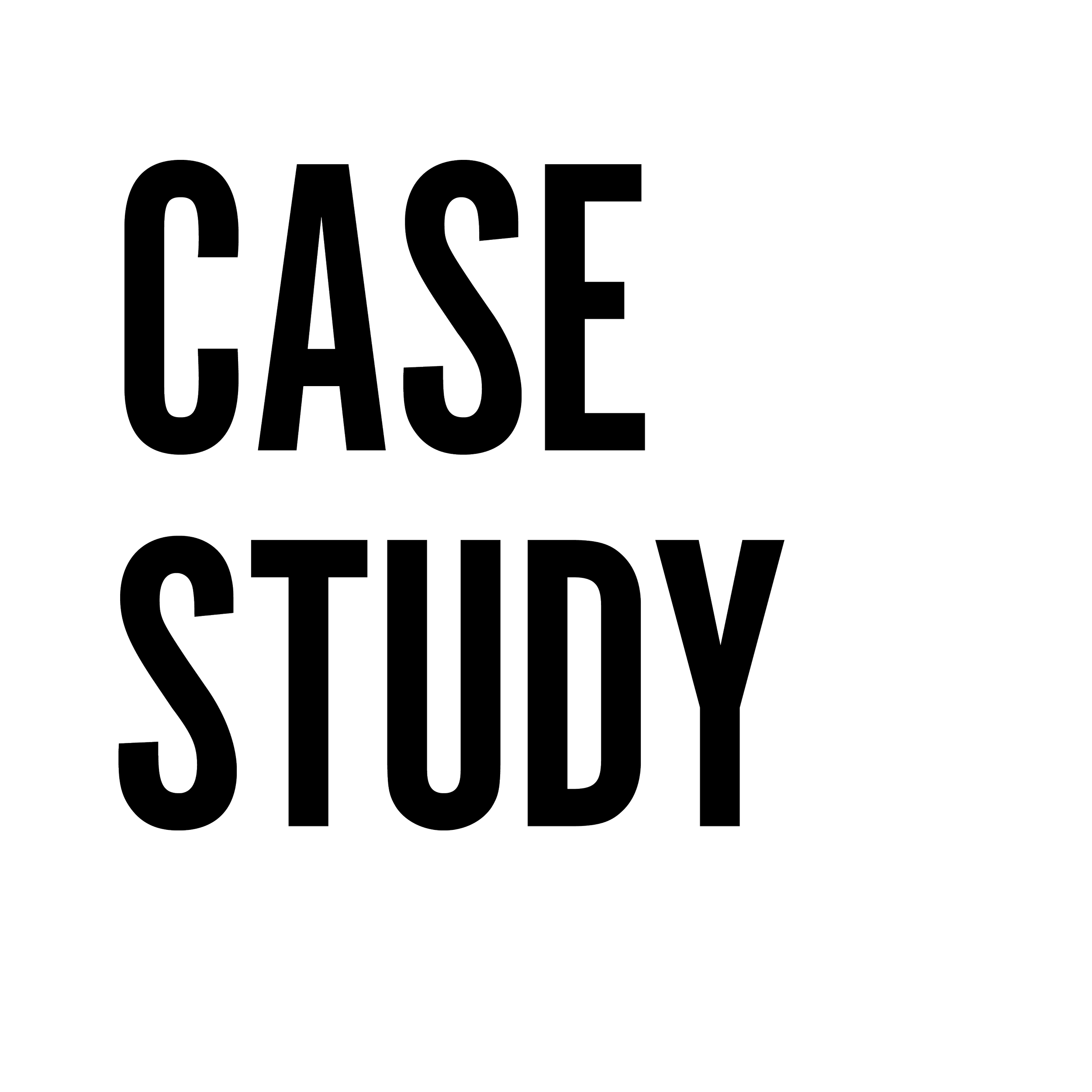
Typeface
Alternate Gothic | URW
Designed by Morris Fuller Benton in 1903, Alternate Gothic is a 19th century style sans serif typeface.
The condensed characters and uniform weight give off a scientific, and almost futuristic feel.
Benton’s other works: Franklin Gothic, Bodoni, Century Schoolbook, and many other famous typefaces
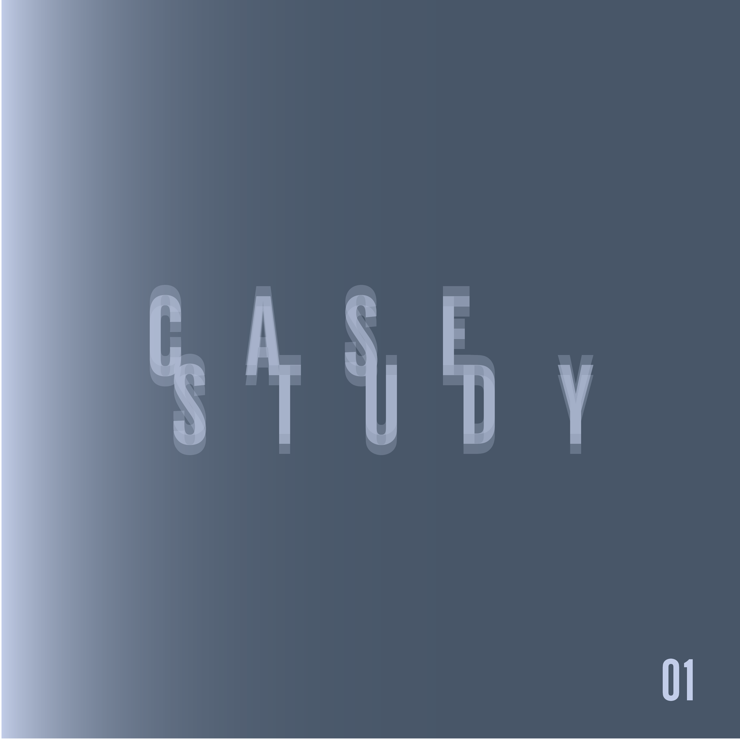
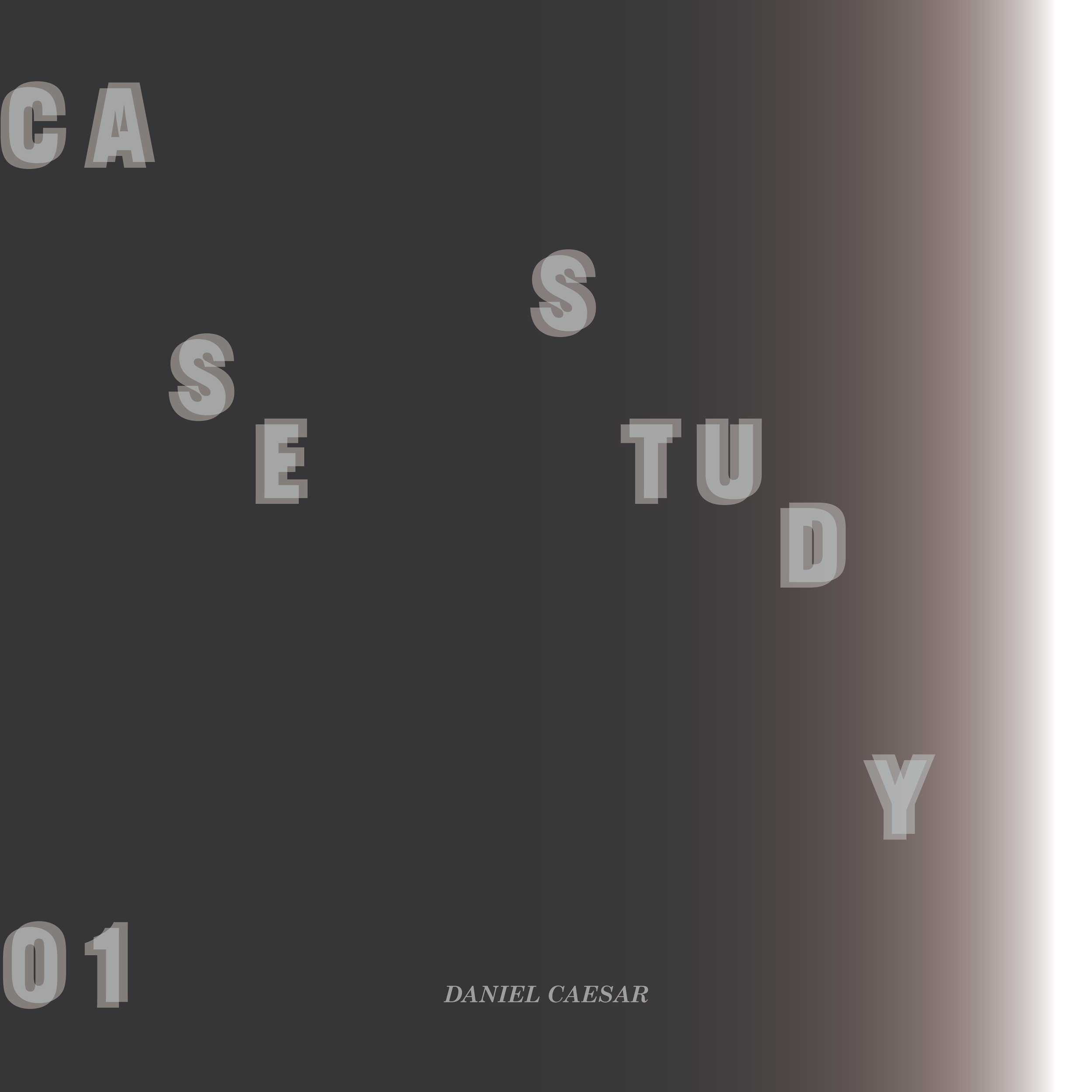
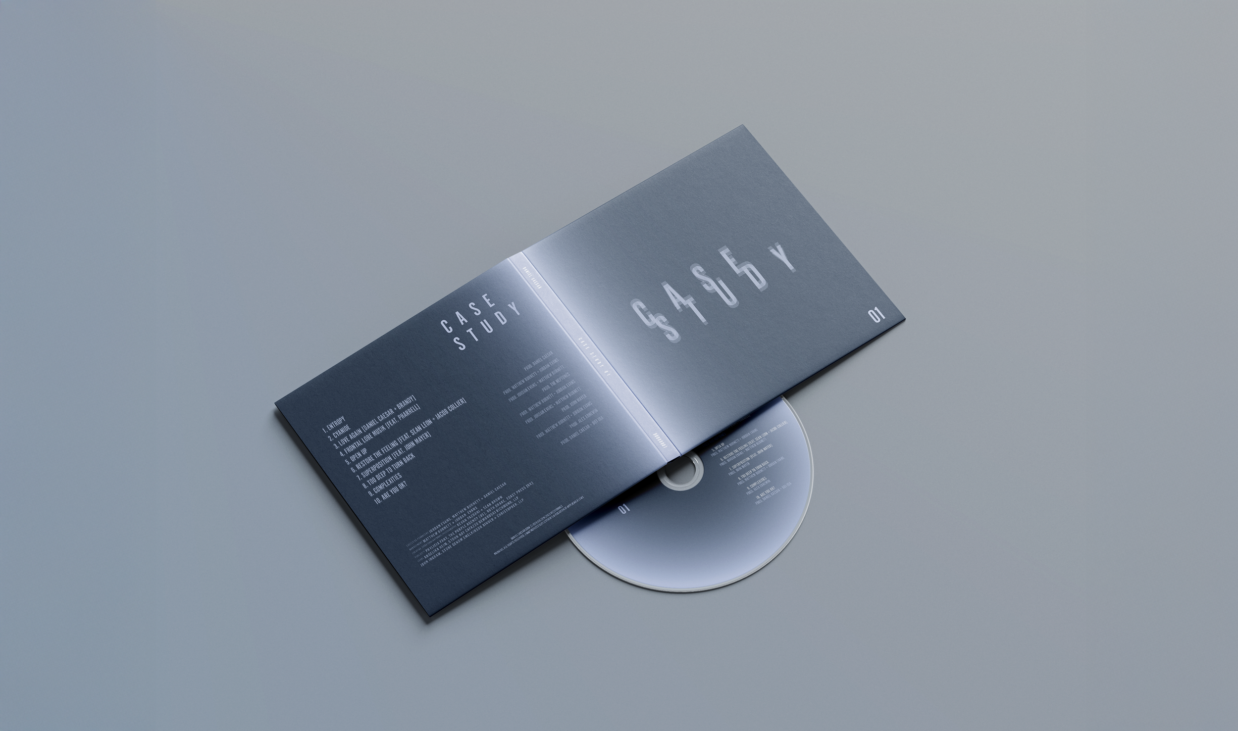
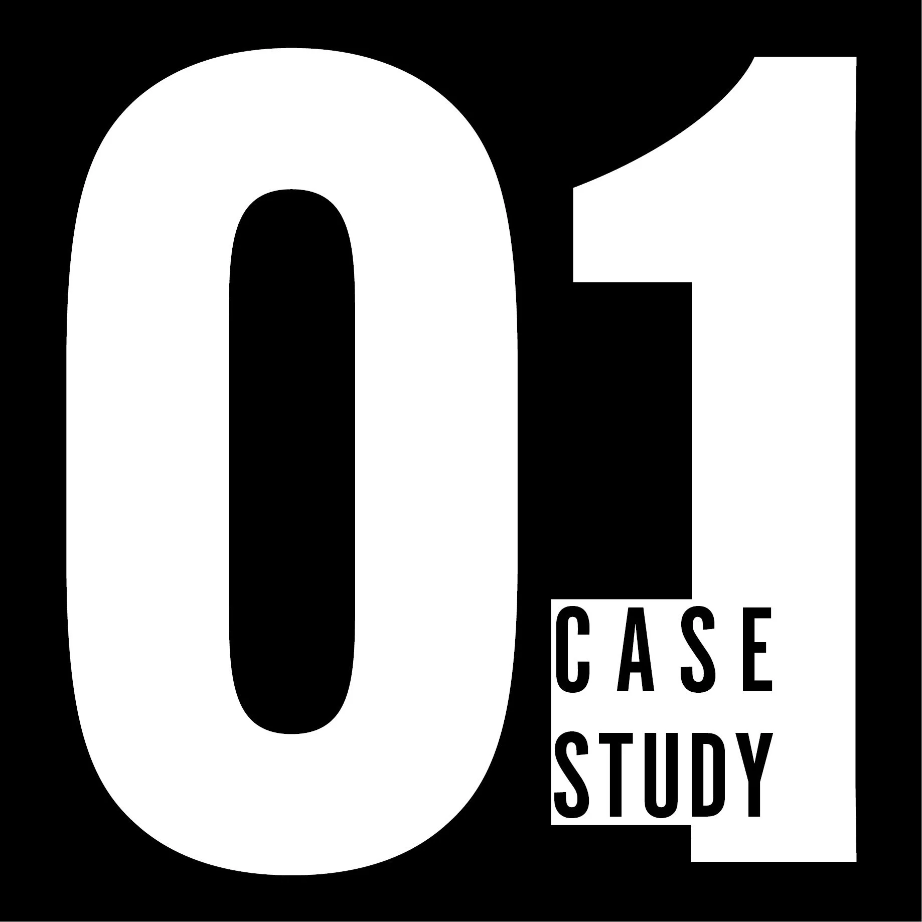
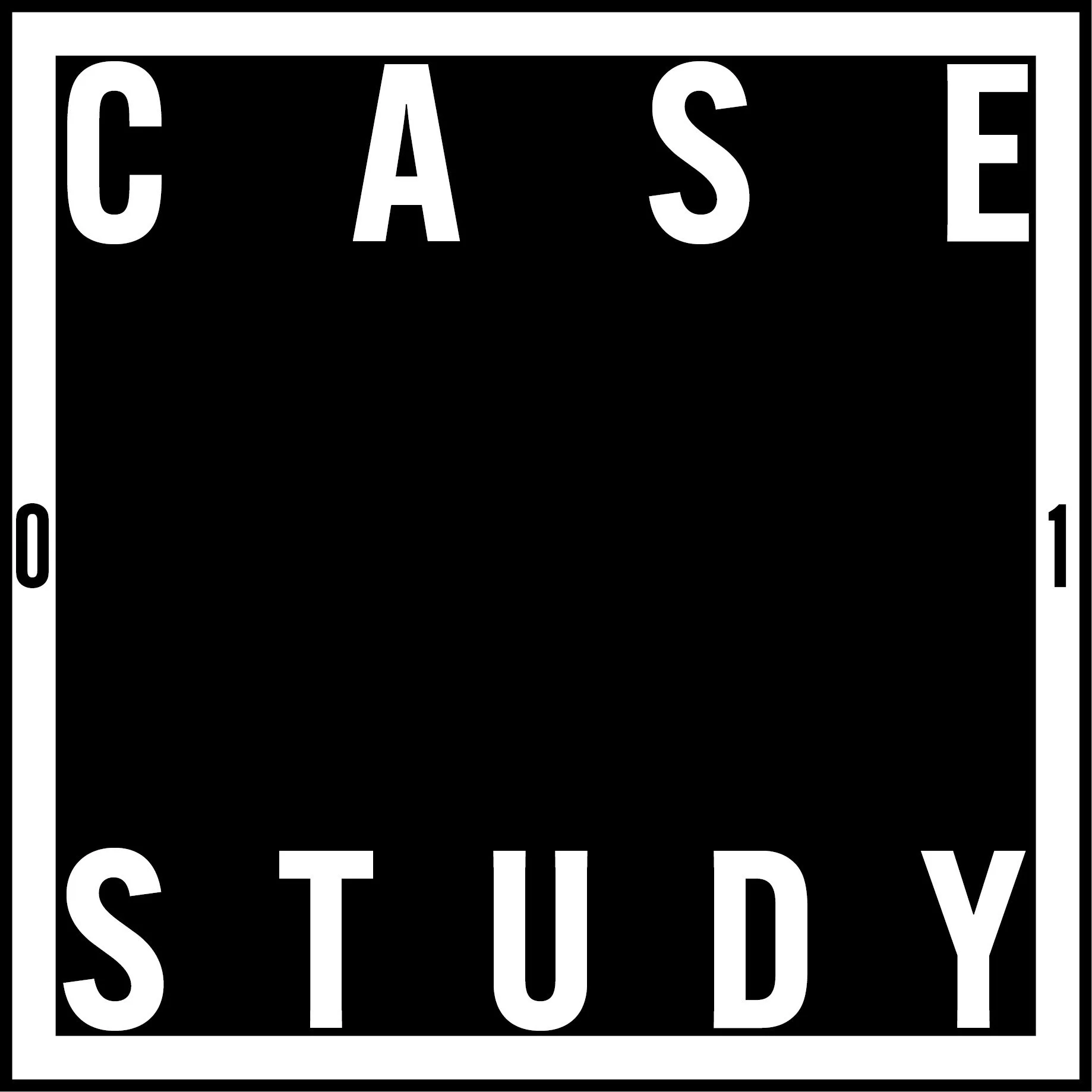
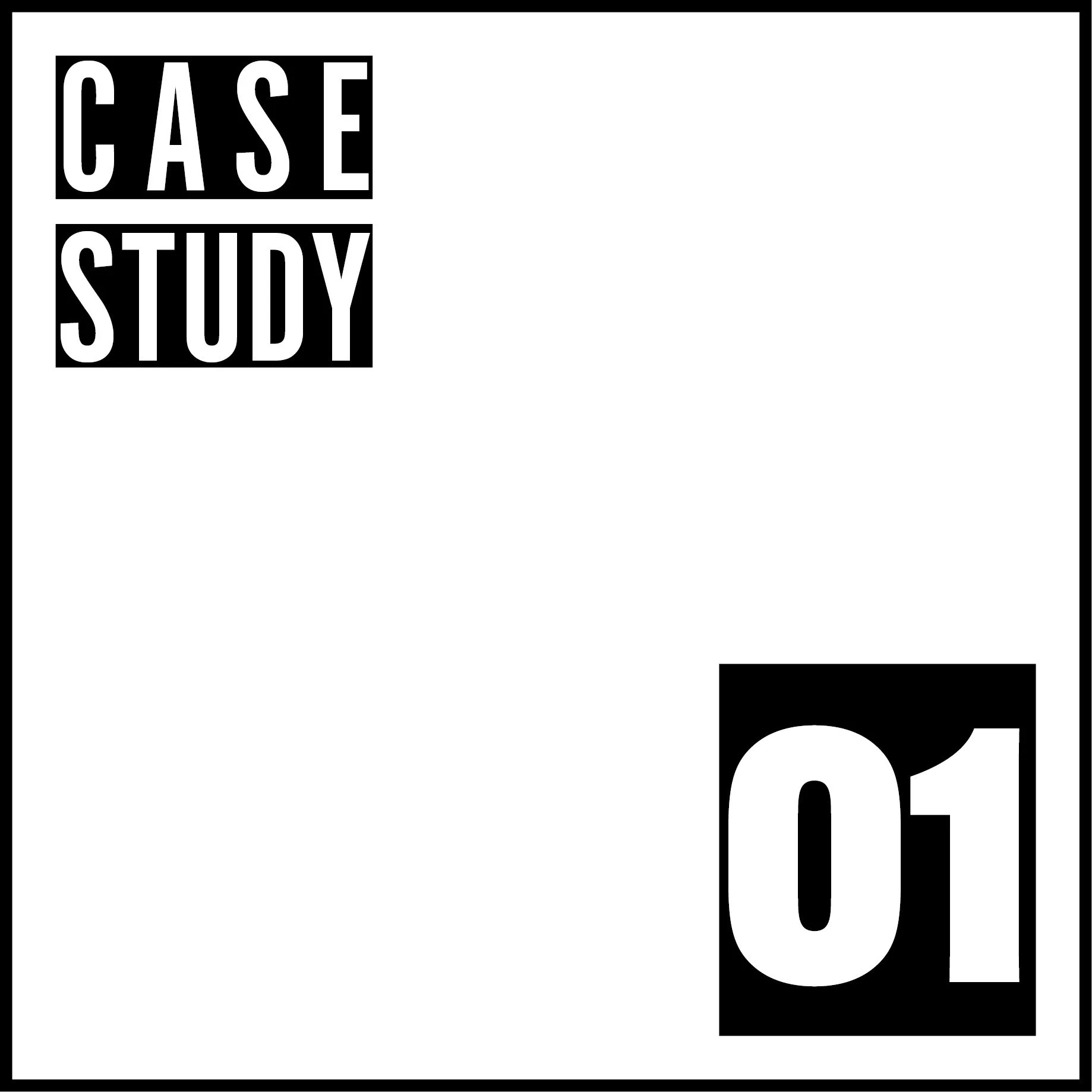
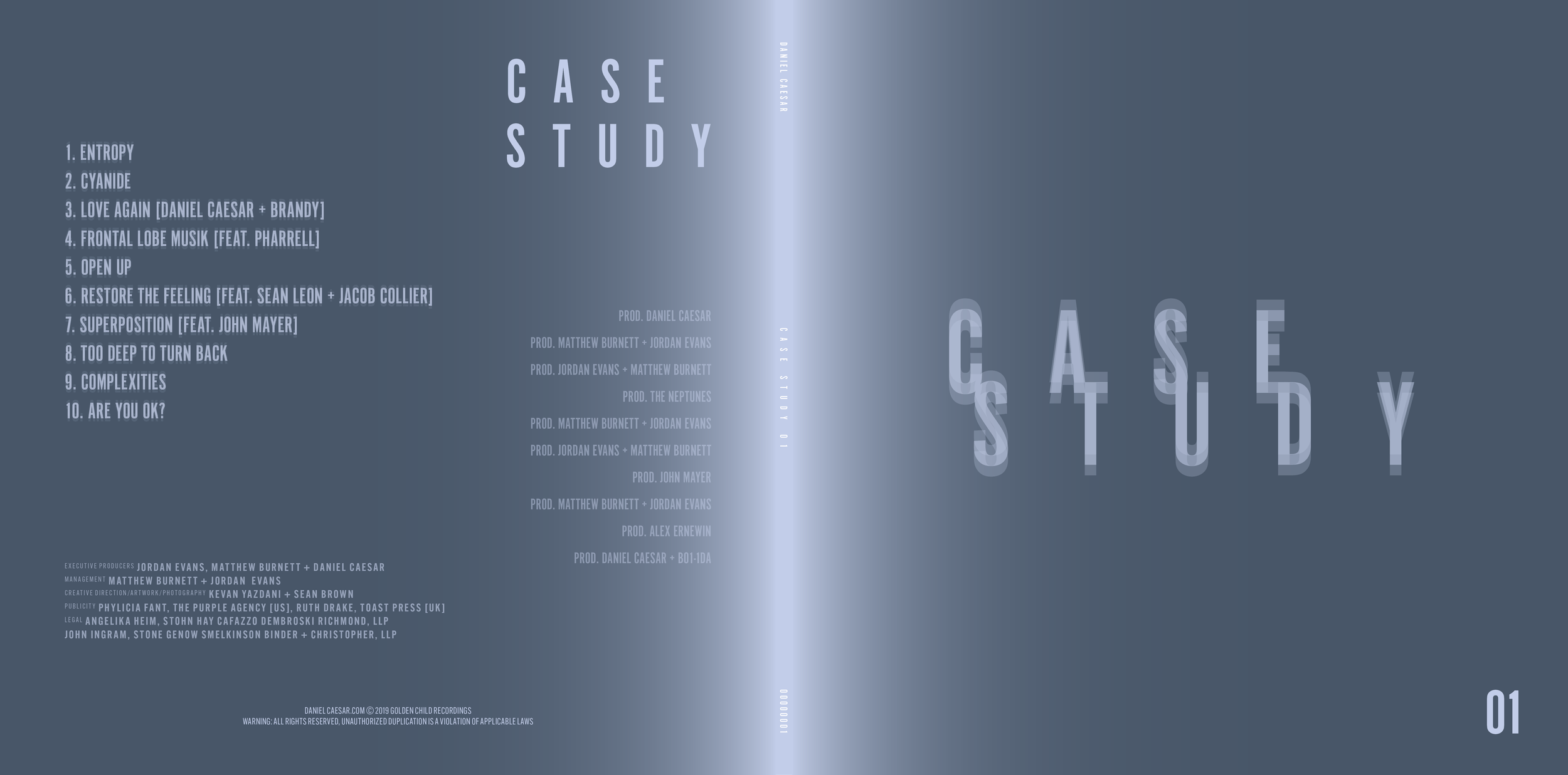
Final Cover + Back
The colour, similar to the original cover, is cold but hopeful. I used a gradient leading to the centre of the spread as it gives off a metallic look.
Sticking to the scientific and experimental background of the album, I went with a layout that reflects structure but is also fuzzy, with the duplicated words forming an optical illusion of blurriness when looked at.

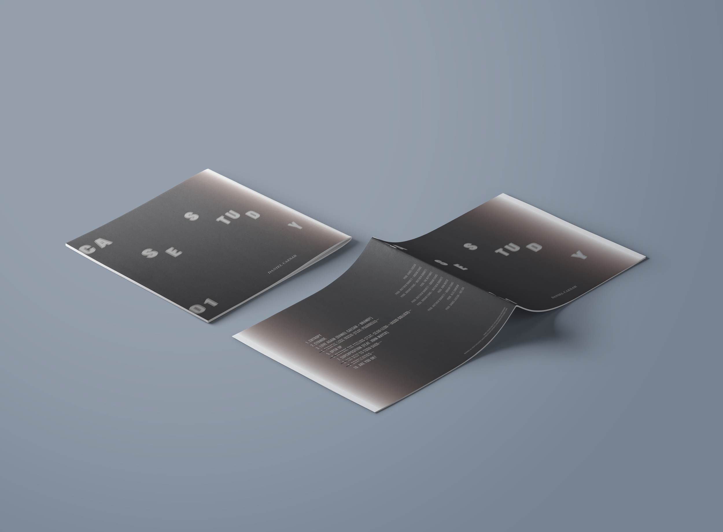
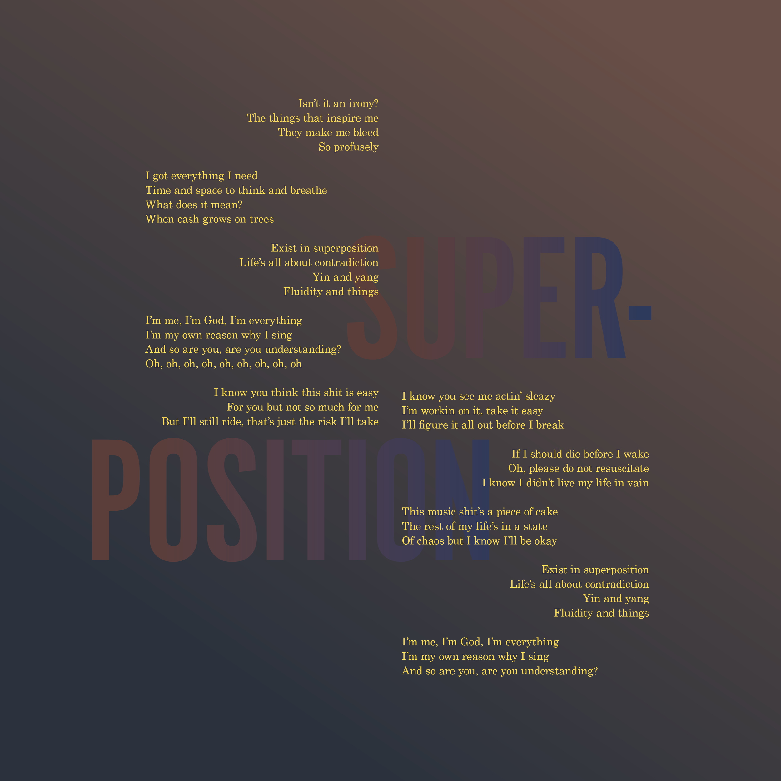
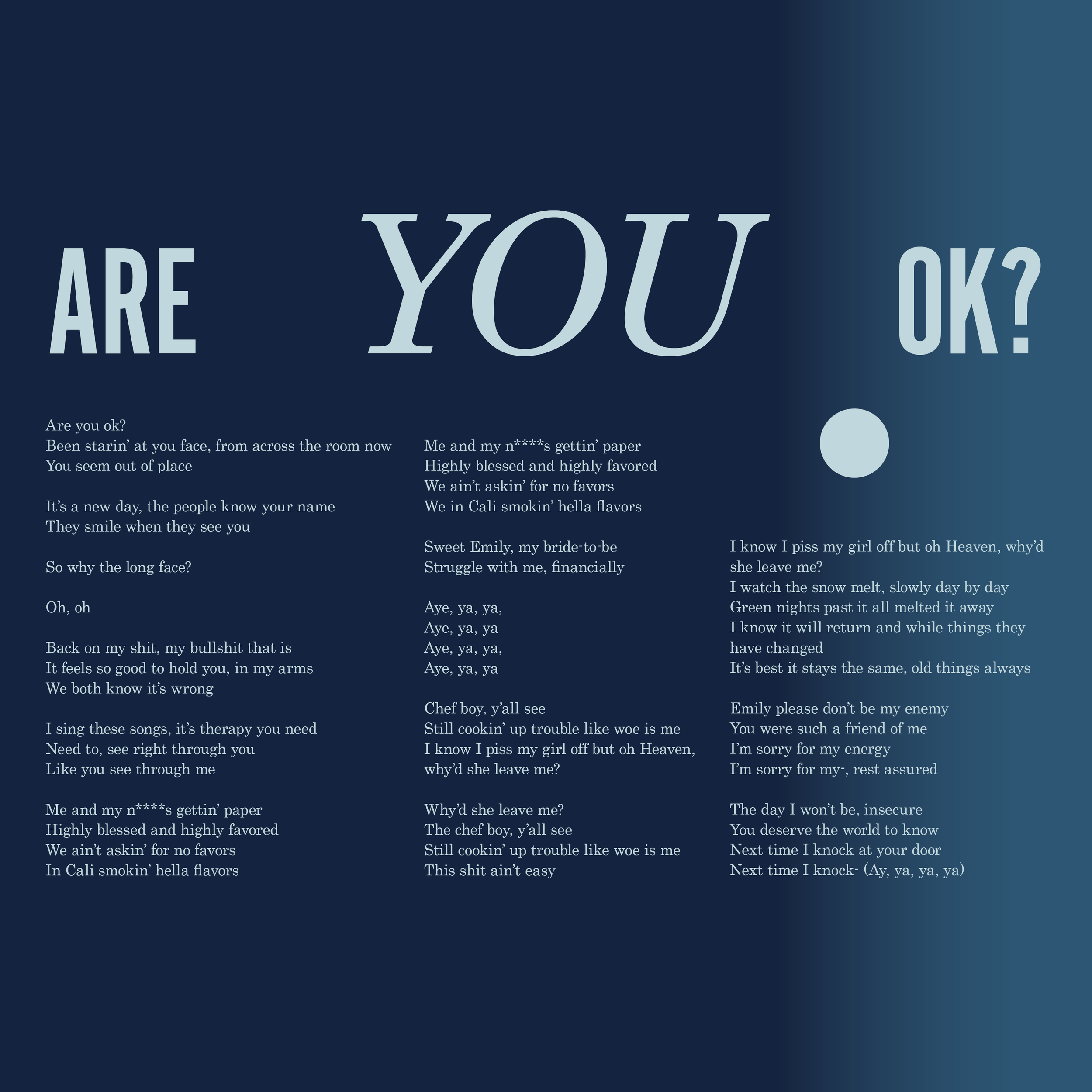
Lyric Book
For the lyric book, I chose 6 songs from the track list and made layouts using grids, typography, and colour.
Lyric Book Cover (front & back)
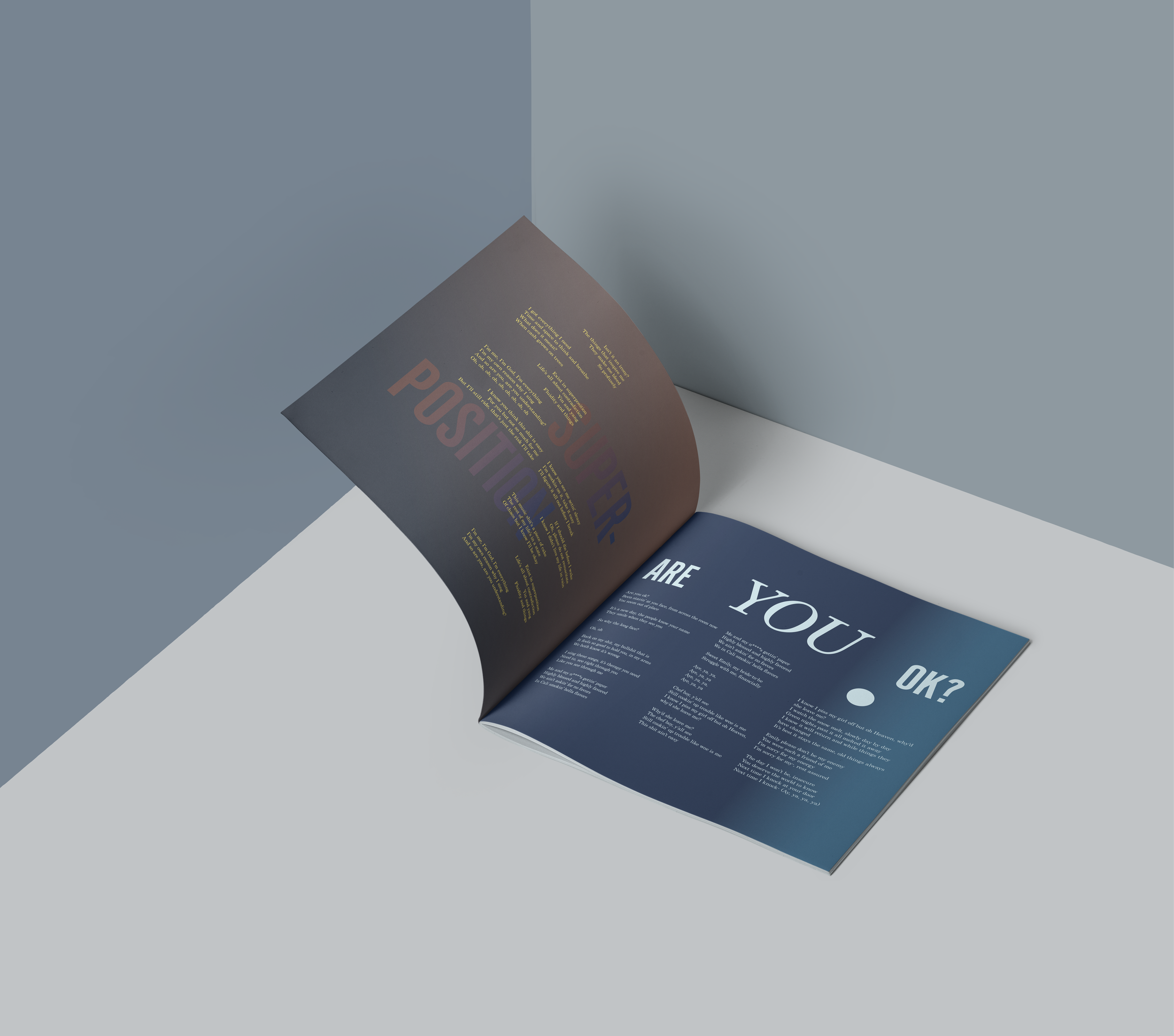
Inside spread (pg. 5-6)
Each page of the lyric book represents the emotions I felt while listening to the respective songs.